2.25.2013

oscar redux

i will confess, i did not watch one minute of the oscars. but i did pick my favorite dresses, obvi.

with the win, Jennifer Lawrence. mostly because of her answer to what she was wearing, and the subsequent press room photo. PS just so you know, in the movie of my life, JLaw will play me.

Dior Haute Couture

in a close second, Naomi Watts. what is HAPPENING with that neckline? j'adore.

custom Armani

in third place, Halle Berry, who never ages. like, what. love this.

Marchesa

in fourth, mostly because she was just arm candy, Stacey Kiebler. but i love this. she was almost second. hell, she was almost first, but i adore Jennifer Lawrence too much to do that to her.

Naeem Khan

here is to someday having a reason to buy a fabulous gown and wearing it with ridiculous heels. le sigh.

2.24.2013

things i do now that i am 30

go to bed at a reasonable hour

go to bed at a reasonable hour during the work week

wear moisturizer with SPF

walk

clean my apartment regularly

plan for the future

think about the future

drink the daily recommended allotment of water

care about my health

remember birthdays

remember to check FB for people's birthdays

keep in better contact with friends/family

remain balanced through various outlets

create/collaborate

enjoy life

life doesn't suck most of the time

2.23.2013

things i do not do now that i am 30

sleep in eyeliner

bite my nails

bite my nails all the time

drunk text ex-lovers

go to work hungover

go to work still drunk

avoid going to the dentist

smoke cigarettes

don't care about my health

overdraft my bank account

do illegal drugs

get in petty fights and/or physical altercations

get kicked out of bars

cry

cry all the time

2.22.2013

pattern play

one of my childhood friends, artist Doni Funkhouser, has a truly unique visual style which she uses to create psychedelic wonder-worlds of color. she also parlays this artistic eye to her very own vintage clothing store, located in our hometown, called Mod Closet. not only does she seek out amazing vintage pieces, but the prices cannot be beat.

recently, she posted work she did as Doctor Funlaw (a combination of her name, and her art partner's name), titled Sailor's Warning, for Spaceships' new album cover I am a Storm at Sea and i fell in LOVE.

in progress

completed work

i just want to ride that wave (even if i've only been surfing once) to a magical universe where there might be dragons. i am inspired by the use of color, and the pain-staking process of drawing something intricate and complex that ends up looking like stained glass that members of Pink Floyd might have in their house.

visit Doctor Funlaw on the world-wide-web, here.

visit Mod Closet in person, if you're in the michiana region, at 201 s. main st., elkhart, in. check them out on the web, here. PS, check out their dope commercial, here.

2.21.2013

design elegance

this amazing device is light enough that the wind blows it around the desert, but heavy enough that it detonates land mines. i bet it's beautiful to watch.

visit Massoud Hassani's website.

read more about the project, and watch a video here.

2.20.2013

illustration / inspiration

kirsten ulve is one of my all-time favorite illustrators; she was a huge inspiration to me during design school. love the wit + whimsy she infuses in her work.

visit kirsten ulve's website, here.

2.18.2013

stuck in the middle with you

my block. stuck in between people who make over 70K USD and under 20K USD. nob hill v. chinatown.

fittingly accurate.

2.17.2013

where will we go

continue tour of world based on tadao ando museums:

next on list = punta della dogana museum, venice, ITALY

next on list = modern art museum of fort worth, fort worth TX, USA

next on list = chikatsu-asuka historical museum, osaka prefecture, JAPAN

next on list = museum of wood, mikata-gun forest, hyogo prefucture, JAPAN

future dated = maritime museum for cultural district, abu dhabi city, UAE

2.16.2013

color studies

pink / light pink / hot pink / white-pink / peach / orange / light orange / sand

blue / green / turquoise / aqua / blue-green / green-blue / grey / black

black / grey / white / silver / dark grey / pearl grey / earl grey

all photos © me, at the sf zoo

2.13.2013

writing sample, deux

on San Francisco, february 8, 2013

you know, sometimes i really hate this city. it's too small. it smells like piss and poo nearly everywhere you walk. there are too many hills that are too steep to climb every goddam day. i step on crack pipes on my way home from work, and because of all the walking i have done i have busted through at least three pairs of black flats per year i've lived here. thats about fifteen pairs of black flats, if you count my oakland years. which my bank account counts them, so you should, too. san francisco is for people who want to live in portland, but have seasonal affective disorder. san francisco is for people who want to be cool, pretend like they're cool and hip and knowledgeable but really they're just insecure assholes. san francisco is sad to walk around, but even sadder on muni buses where people piss and freak out and go nuts and steal your iphone. so i've heard. i actually was on a bus where someone pissed and the driver wouldn't let him off. so you jump off to avoid the piss. and then you walk. and walk. and walk up a hill. and then you finally make it up the hill, and look across that vast bay to the marin headlands. you turn ninety degrees and see the bay bridge expanding past the ferry building. you turn ninety degrees and see the hill you just walked up, with a cable car chugging up it. you turn ninety degrees and see ONE MORE ONE MORE ONE MORE HILL. you turn ninety degrees again, and start walking those last few steps to home. up ten steps. up the elevator. into your apartment which you love love love. then you remember why you live in san francisco. and you love it.

2.12.2013

writing sample

on LA, circa 2004

i love LA. i know i'm not supposed to because it's smoggy and gross and disgusting and there's weird people in hollywood and you can't get anywhere without a freeway that's jammed and there's never cheap parking and there's exhaust and you can't breathe but there is something about this city that sucks you in spits you out and you don't really seem to mind. an energy. teeming with people crammed to the gills with cars just mad chaos. is it ADD? perhaps. and then you get to PCH and it's calm, even when your sitting with 5 million other people in cars. you roll down the window hear the surf breathe the fresh air see the sun glinting on waves crashing into cliffs coming down a hill to see a coastline rocky and hilly and crammed with beautiful beachfront homes and then it makes it all worth it. that coast. it sucks you in even if you hate all of LA.

2.11.2013

3020 laguna street in exitum

almost a year ago today, a unique temporal art experience

yulia pinkusevich, data mass projection

chris fraser, outline

jeremiah barber, dreamburn

andy vogt, drawn out

other photos i took and improperly catalogued. if you know who did these works of art, please let me know.

2.10.2013

random bits of randomness

from travels / city walks

union square, san francisco

the five-and-dime, st. joe

the wall of my childhood closet, elkhart

the former museum, san francisco

2.09.2013

4.03.2011

all i have to show for is this


what do you do in your kitchen? i stain large pieces of board.

conceptually, i thought developing a product binder that represented my Ministry of Craft brand would be relatively easy. i'm quite good with layouts, and adept at utilizing inDesign, illustrator and photoshop. little did i know that the process would take more than a month, full of meetings with friends and artists. and that it would force me to consider my "brand" and how i wish to represent it.

why, being the smart girl that i am, did i not think it would force me to consider my brand and how i wish to represent it?! you've all heard the adage, it's hard to see the forest through the trees? i got so focused on the "trees", i.e.: the separate components of my product binder (what pages? what font? what copyright information?) that i lost sight of the forest, or rather, my brand.

i'm not afraid to admit that i often lose the bigger picture, either at my day job, or in my side business. it's good to have people that remind you of the bigger picture, to help you zoom out, and see what you're missing, or to show you what path you are on.

so, i found myself on a sunday afternoon staining a large piece of board that will act as "hunting lodge" for my taxidermy heads. though i know this means starting (almost) from scratch with my product binder, i feel the end product will be more cohesive, and better represent my brand.

3.20.2011

there's a map of the world on the wall in your room


nathan's studio (detail)

i had an interesting experience this weekend that i’d like to share. i was asked very recently to start a music column for Nighthawk Press, a literary review based out of Chicago (which you should definitely check out). i immediately jumped at the chance, and 48 hours later had not one, but two very lengthy posts submitted to the editor. then, i got to thinking about the neglect of my own personal writing. why can’t i write for my own blog, yet can set aside time to submit to another? the weather in San Francisco finally broke today, and i went for a walk, and thought a lot about this conundrum, and came up with a few interesting points.

one: it’s easier to rely on someone else to edit and publish content. all you have to do is write and submit, and you’re done! simples! when I sit to write a post, i think about how much time i have, how it’s going to look with the site, is it too lengthy? what image will i use? what do i want to say? and then, most of the time, i get tired and go do something else.

two: i find it’s easier to write about something you’re not directly involved with. i am not a musician, nor do i wish to be a musician. my posts for Nighthawk are all about my passion for music. for myself, i find it easier to write about something i am removed from. as a fan of music, i can write whatever i want. as a visual artist, i consider every point i try to make as an artist. i aspire to create, and write, with intention. and i find myself self-editing more when i write about my work, especially when i feel the pressure of how i choose to express myself.

three: music is so consumable. you can multitask while listening to music. in fact, i’m listening right now! i find that you can’t really say that for any other art form. since it is so consumable, you can experience a wide variety in a short amount of time. for other visual art, like film, you have to sit and absorb for two hours. music is really the people’s expression.

four: most visual art, unfortunately, has some accessibility issues. of course, with the internet and the “democratization” of art (which can be argued as a good or bad thing), accessibility is no longer the limitation it once was. i can spend three hours down the rabbit-hole and come out with twelve new artists that i love. but the roots of art still lie in a hierarchical and, for lack of a better word, elitist environment. art and the artist seek to reach people, but the structure of the art world is still very insular.

to elaborate further on the fourth point, i’m lucky enough to operate in the San Francisco art community, which i find very open and collaborative. collaboration is what will carry art and the artist forward. we no longer have to operate in the bubble of the art world. we can be committed to reaching new audiences, and can work together to build new communities that are inclusive and engaging. we share resources, and spaces, and within those collaborations we find something bigger than ourselves, which is very powerful.

as for me, i’m going to continue to write with intention, but not be so self-edited that i find i have nothing to say.

3.03.2011

playground love

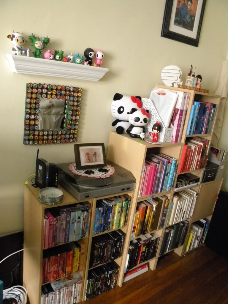
i find to do my work, i have to have an organized environment. i had been quite happy with the layout of my apartment, which also doubles as my studio, but in the passing months, everything got a bit "misplaced." so, i took the time this past weekend to clean house, and make it more visually pleasing. i am quite pleased with the results.

here are my bookshelves, which i decided to "color-code":


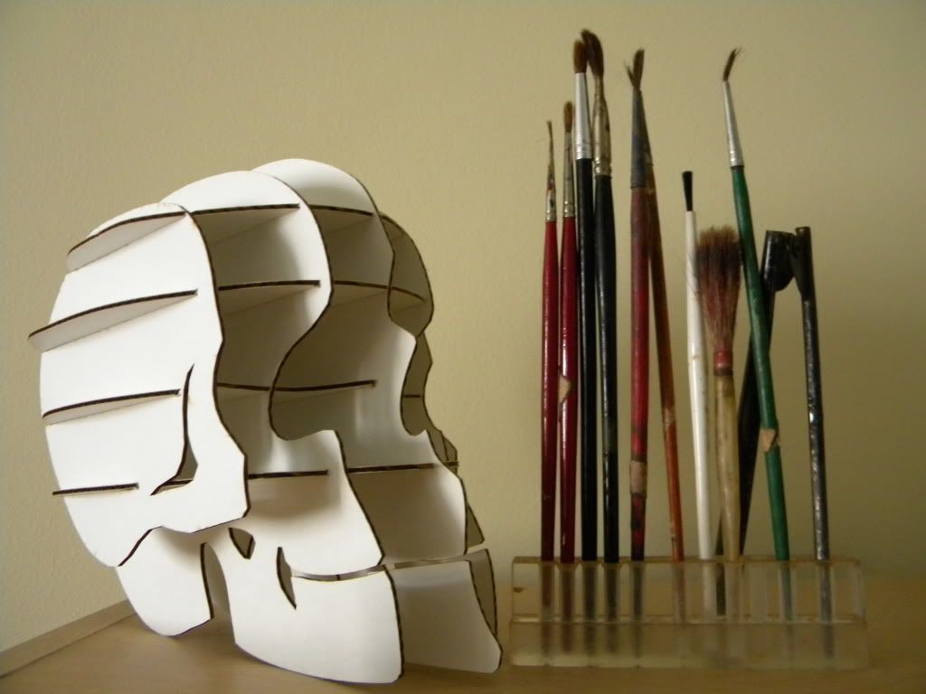
bookshelf detail, cardboard skull i found in Chicago and my grandfather's paintbrushes with custom plexi stand he built:


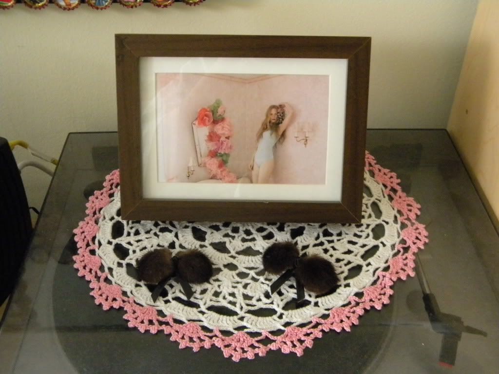
bookshelf detail, framed postcard from stella magazine, mink shoe clips found at the vintage clothing fair, and a doily my great grandmother made:


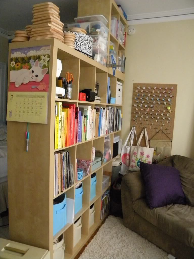
room divider, which separates my small studio into two rooms. this is the living room. all of my art supplies, fabric, and art-related books and magazines are stored here:


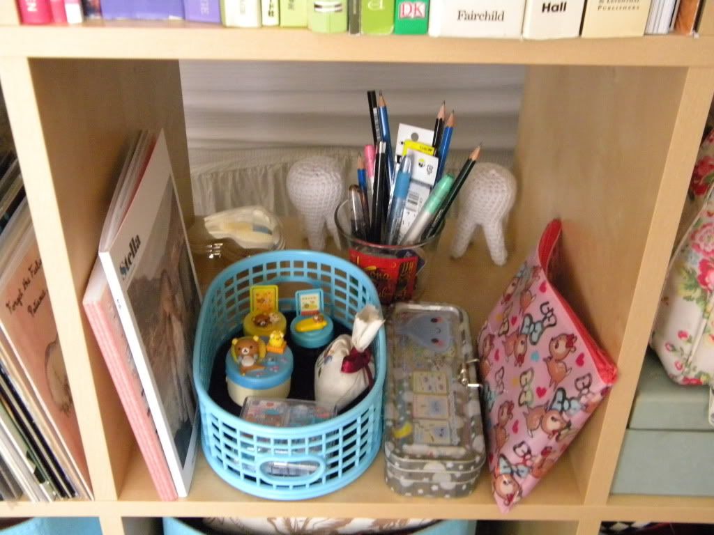
divider detail, my drawing pencils, crochet teeth, stella magazine, vol. 1, and rilakumma toys:


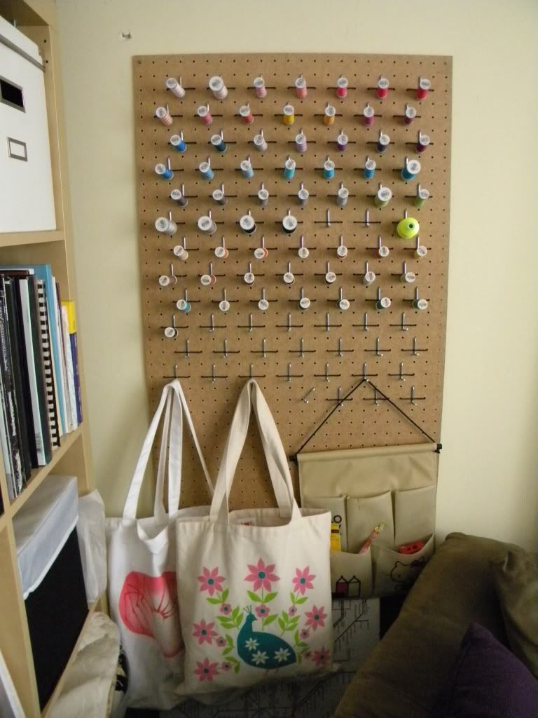
the solution to my thread storage issue - i bought pegboard and pegs from the hardware store. i like it because it also serves as additional hooks for storage:


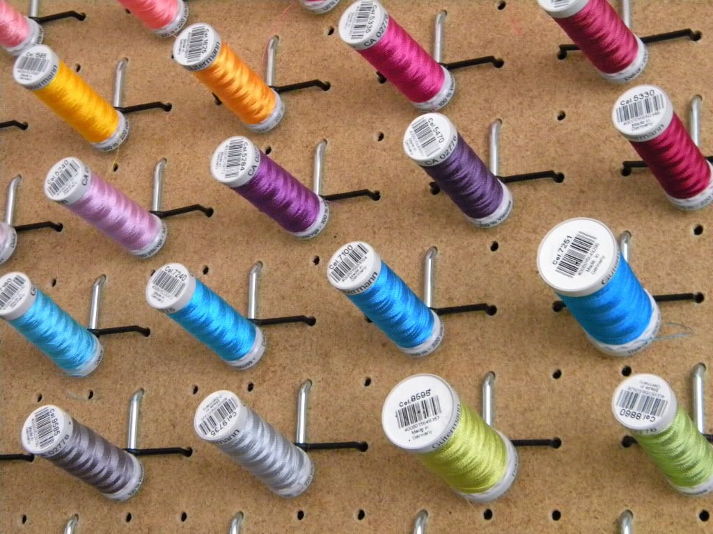
Gutermann embroidery thread, the best thread in the world:

1.30.2011

why not try it all, if you'll only remember it once...

so i haven't been a very diligent blogger, as you can tell. and frankly, the photos i have posted of my own work haven't exactly been inspiring. so, this is the perfect opportunity to start over. i have revamped the image and the meaning behind this blog in the attempt to take myself more seriously as an artist, and to produce even more work that inspires me. and, in the hopes that in 2012 i'll be ready to apply for an MFA program either here or abroad.

here is the first installation of the new and improved blog. i hope you like it.


seated girl #2, 2010/2011, 4'x4' canvas


seated girl #1, 2010/2011, 3'x6' canvas


seated girl #1, detail


seated girl #1, detail